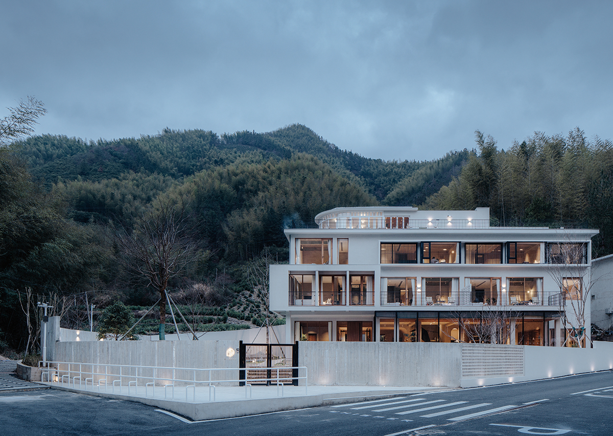
Tangkou town, 1 km long from the south gate of Mount Huangshan, is the main life service and the tourist reception base. The project to be reshaped is located at no.1 Xiaolingxia, Gang Village. The original building is a typical old-fashioned scenic hotel and seats at the west end of the whole building complex along the road. The Gang Village Road is located in the southeast with a wide visual field. The building faces the mountains to the southwest, a stream flowing by at the foot of the mountain. The courtyard plot, situating to the southeast façade of the original, looks like a triangle, and the whole boundary of the building is blurred. As part of the building groups along the road, some buildings are affected by the road direction on their boundaries, and other boundaries are formed owing to the surrounding natural landscape that they encroach on each other’s space. Outside the garden is a country road from north to south and on the other side of the road lies the parking lot. It is apt to overlook the height difference in the process of initial measurement, due to the hardened slope as the ground, while actually, the relative height difference between the interior floor of the upper building and the road is approximately 1.5 meters, which is an essential factor for the reshaping of architectural space.
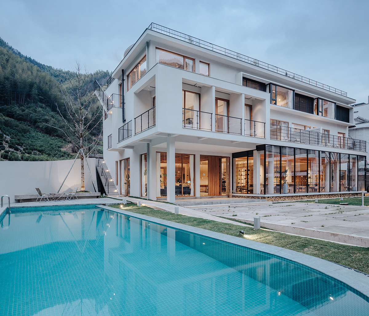
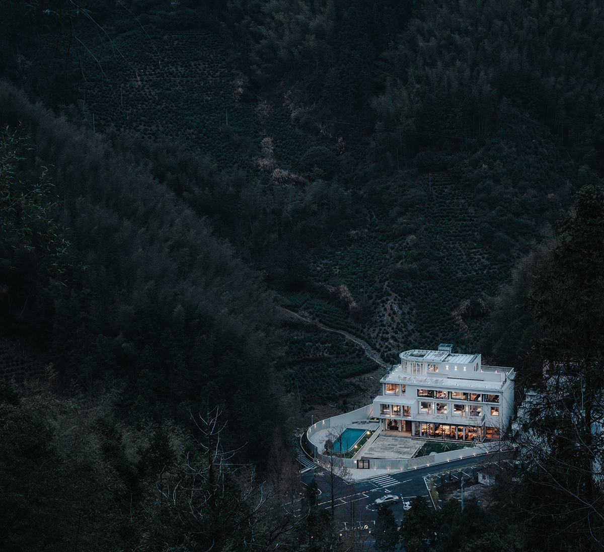
Although interior space of the building was originally planned for living, it doesn’t meet the current accommodation requirements, as the unified flat planning design and highdensity rooms result in bad daylighting and narrow washroom space. As for external façade of the building, the first thing we should do is to remove element collage, including glazed tile decoration of the balcony and the long wall of the armrest at the top floor, and the huge hotel door-head, for space expression. Beyond this, remodeling architectural space is the best for overall arrangement of indoor and outdoor spaces. In the transformation designing, a problem has been repeatedly proposed, that is “how to make sure the boundary is manageable?” It is inevitable to discuss the triangular courtyard when we are considering the functional layout and design of the general plane. Thus, whether from the courtyard or the interior to the outside of the physical boundary, you will always see an area formed by an Angle. Our idea is to weaken its visual presence. Firstly, the entrance to the courtyard is positioned on a tangent parallel to the building, so that the triangular region is shrunk to an extreme, namely, it is the lowest part in height difference treatment. In addition, a semicircular arc is added to work in concert with parallel tangents of the building. The cast-in-situ concrete bounding wall is embedded into the site and connected with the existing walls on both sides. As a material boundary, the bounding wall is expected to be well-proportioned together with buildings. We reserve a portion of the grille square partition made of material the same as the cast-in-situ bounding wall, enhancing boundaries while maintaining the visual extension.
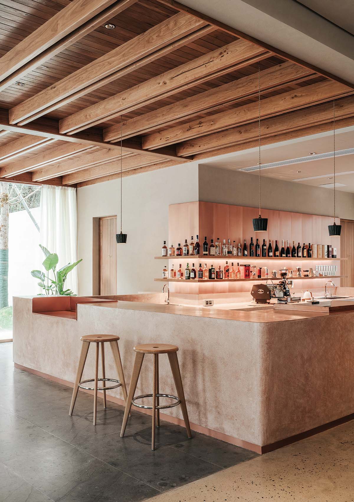
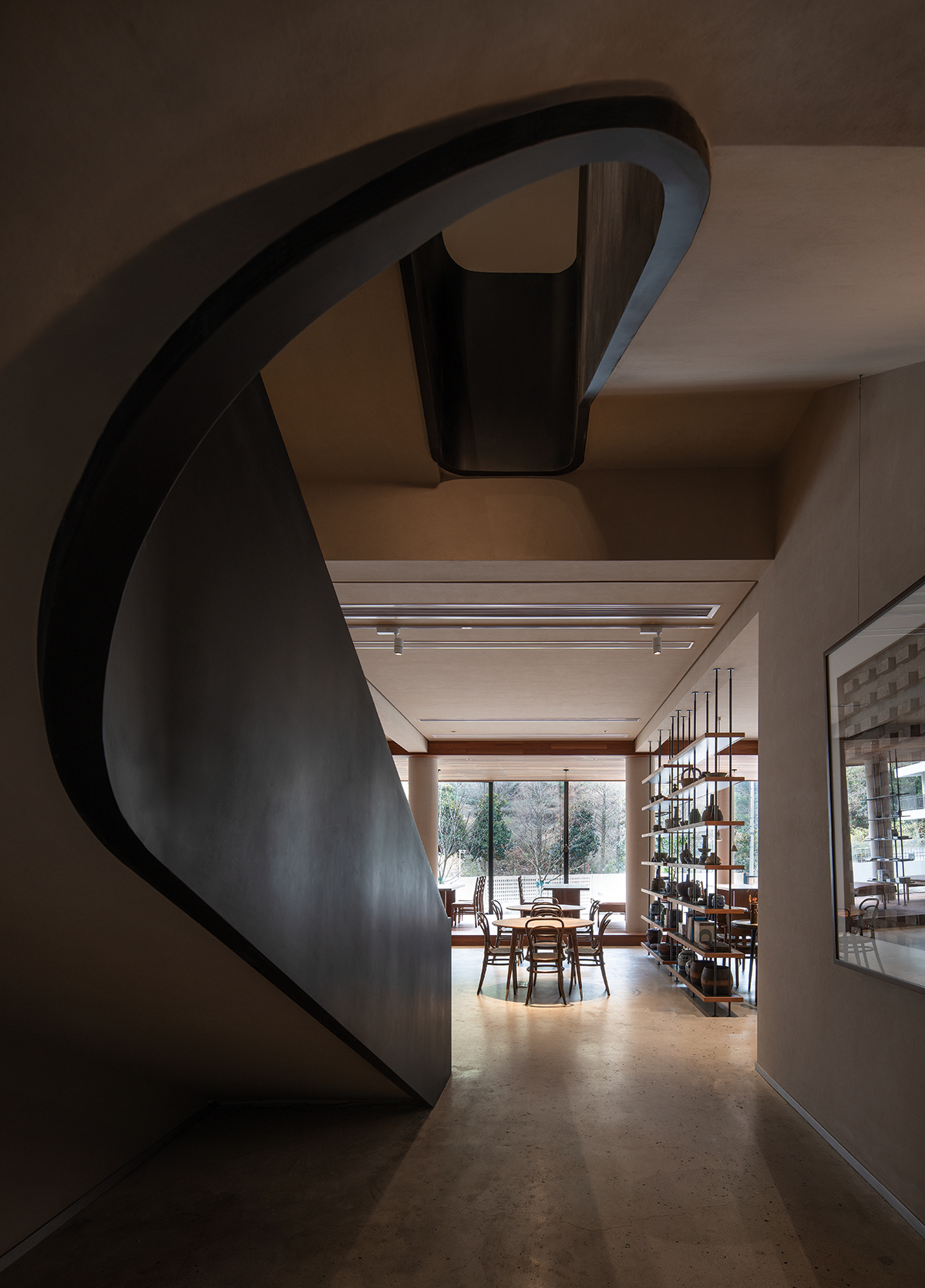
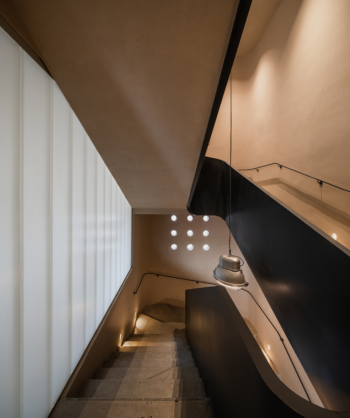
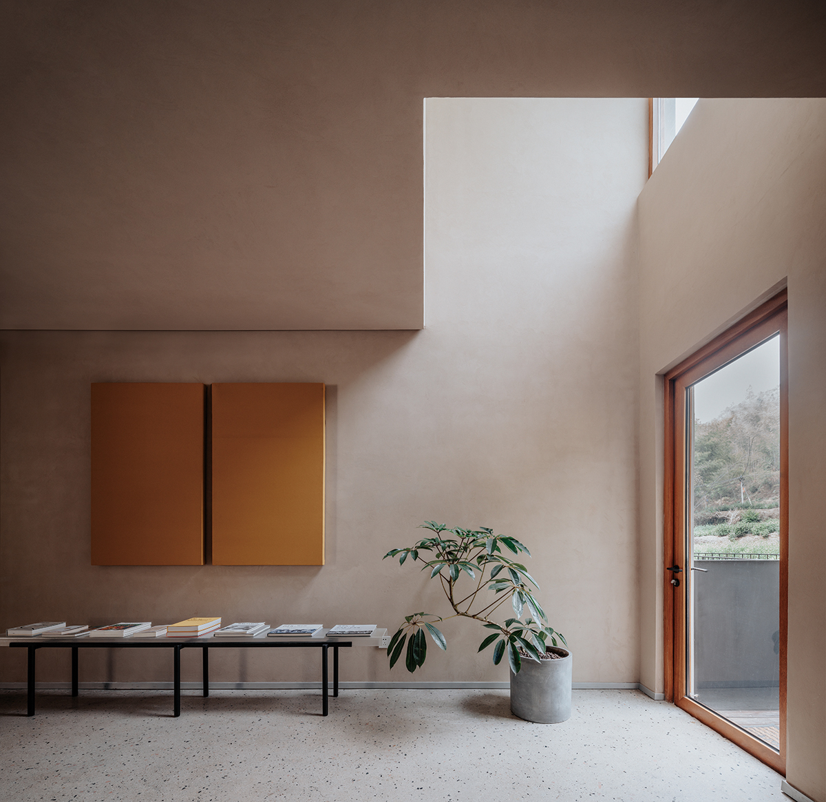
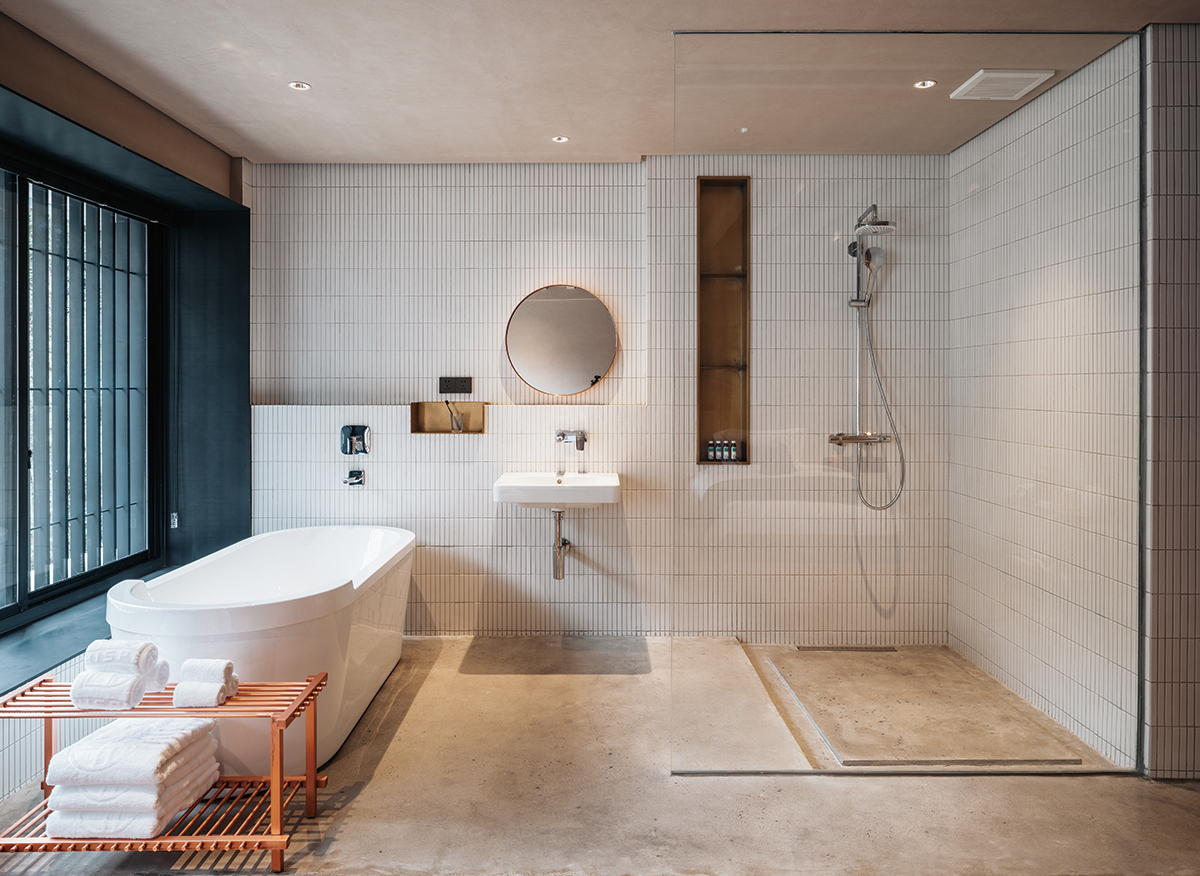
Reshaping of the building facade and interior space. The first floor of the building is the most important public area of the whole guesthouse, functioning as the reception, dining room, activity areas, and logistics and support office; the second and third floors are mainly guest rooms; on the top floor, there are duplex two-story bedrooms and an outdoor independent terrace, besides a multi-function hall. There are 13 rooms in total of different size and different designs.
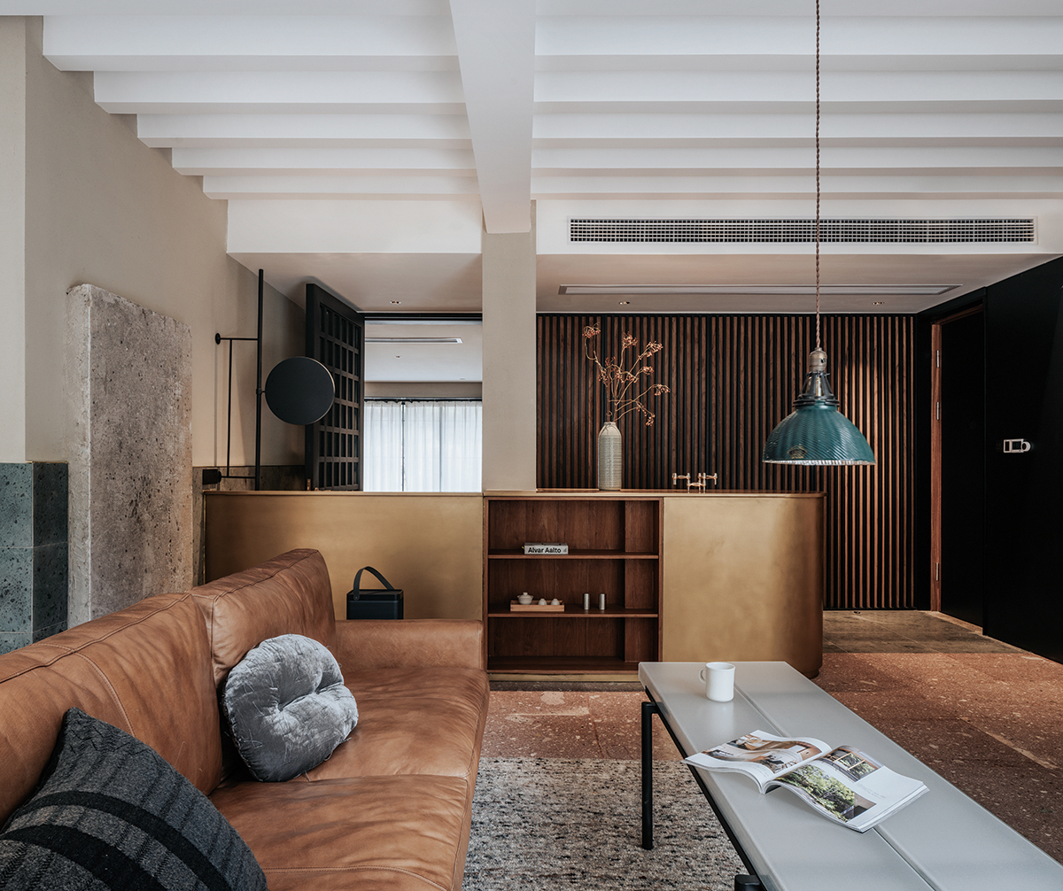
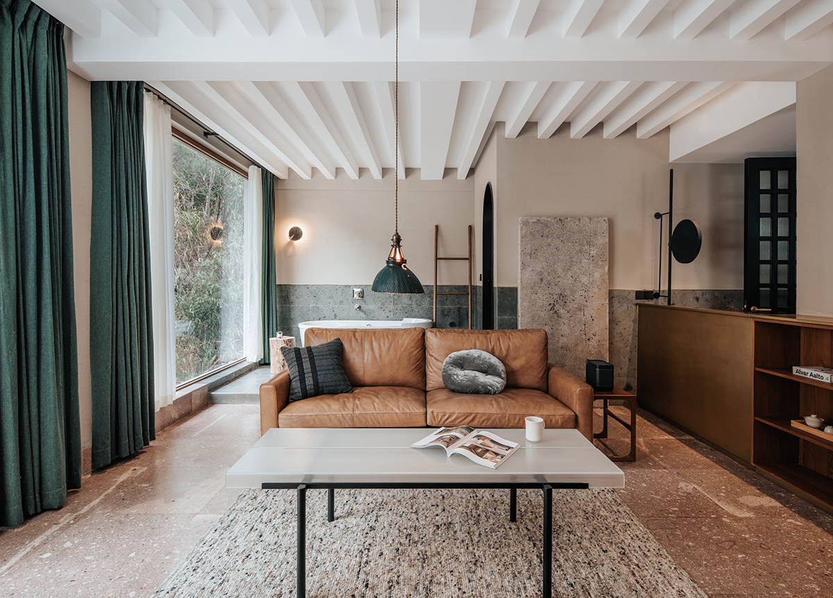
On the building façade, the original porch is converted into a raised dining area as a part of the façade; on the third floor, bay windows are added to form a threedimensional effect, which also expands the outdoor part of the room, allowing more sunlight for the rooms and creating a visual extension. The main entrance door is designed on a vertical line-of-sight near the courtyard door. Because of large gap of relative height difference, an accessible ramps is placed between the courtyard door and indoor space. So the courtyard door is divided into three, of different heights; the pool and the indoor floor are on the highest terrace; The courtyard entrance is the first independent height terrace; the courtyard entrance is the first independent height terrace,and the
second on is the SLATE surface of the courtyard. In the motion trend designing, there are invisible wandering routes in the building besides the functional streamlines. As a result, you may choose to follow a quick route to get your destination, or to try arc stairs, or projecting stairs, or both. As you’re walking around in the building, your mind will form an overall impression, which is stored in a fragmented visual way. In the transformation of the whole project, the insertion of the patio makes it possible to overlap the spaces to different degrees. A light patio between the main building and its auxiliaries is designed to allow a large amount of light and air convection from the north direction of the first floor. As for the patio of the main staircase, the original stair steps are only reserved for handrails at a bird’s-eye angle. The staircase through the first floor is re-poured and the patios both of the second and third floors are all renovated, to form a whole patio going through three floors. To a certain extent, this is also the guiding effect of the clearance space. There is also an auxiliary small patio between the second and third floors, increasing the interest of architectural space while maximizing the daylighting for the north space. Although long skylight of the second floor has been retrofitted before, this time, we use frameless processing completely and allow sunlight to enter into space from the roof, creating a sense of mystery. The appropriately represented boundary indicates it has an interior domain. Offsets can also be part of the creation.
second on is the SLATE surface of the courtyard. In the motion trend designing, there are invisible wandering routes in the building besides the functional streamlines. As a result, you may choose to follow a quick route to get your destination, or to try arc stairs, or projecting stairs, or both. As you’re walking around in the building, your mind will form an overall impression, which is stored in a fragmented visual way. In the transformation of the whole project, the insertion of the patio makes it possible to overlap the spaces to different degrees. A light patio between the main building and its auxiliaries is designed to allow a large amount of light and air convection from the north direction of the first floor. As for the patio of the main staircase, the original stair steps are only reserved for handrails at a bird’s-eye angle. The staircase through the first floor is re-poured and the patios both of the second and third floors are all renovated, to form a whole patio going through three floors. To a certain extent, this is also the guiding effect of the clearance space. There is also an auxiliary small patio between the second and third floors, increasing the interest of architectural space while maximizing the daylighting for the north space. Although long skylight of the second floor has been retrofitted before, this time, we use frameless processing completely and allow sunlight to enter into space from the roof, creating a sense of mystery. The appropriately represented boundary indicates it has an interior domain. Offsets can also be part of the creation.
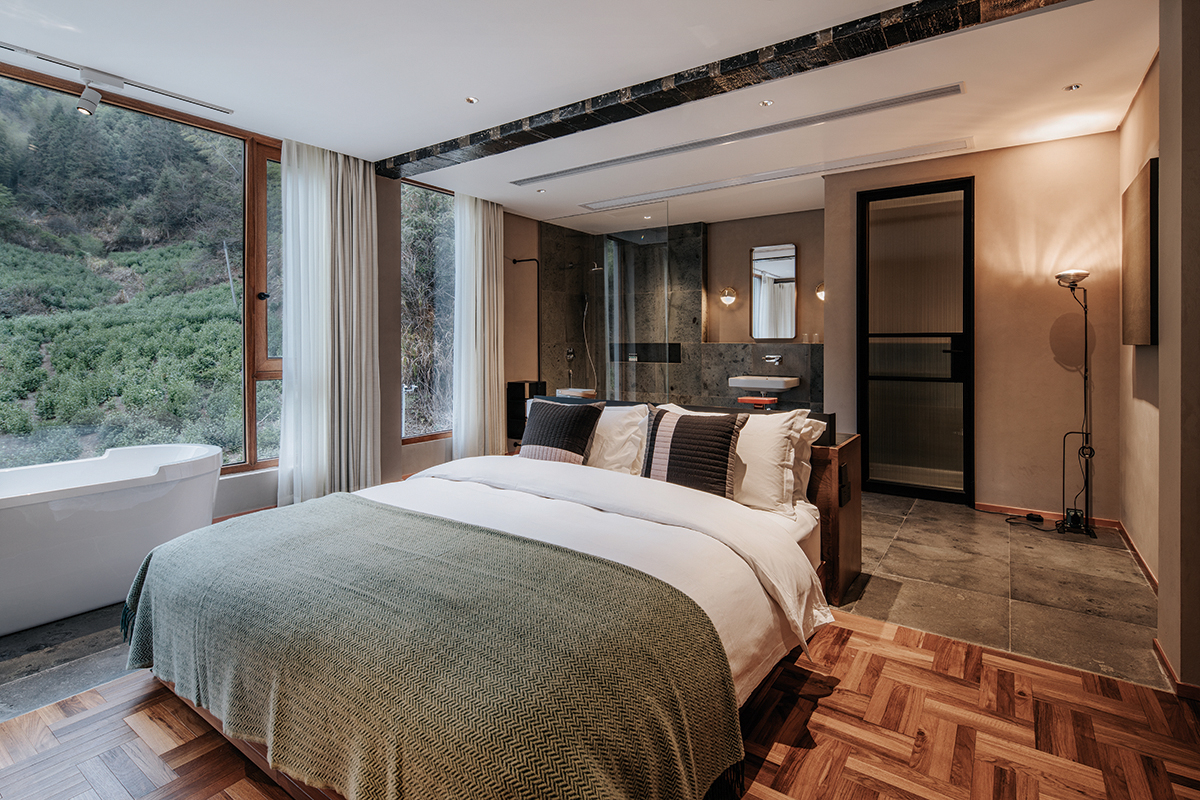
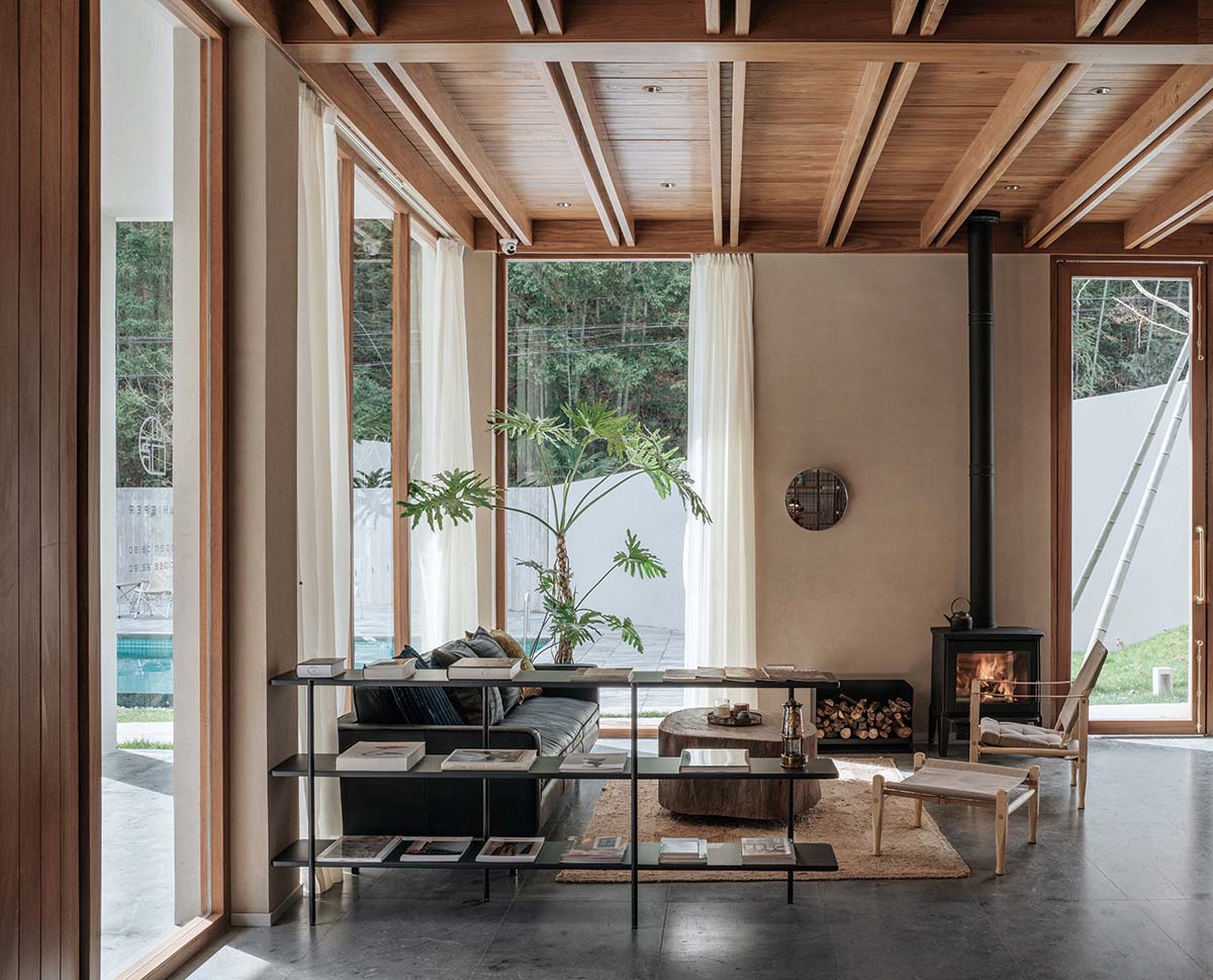
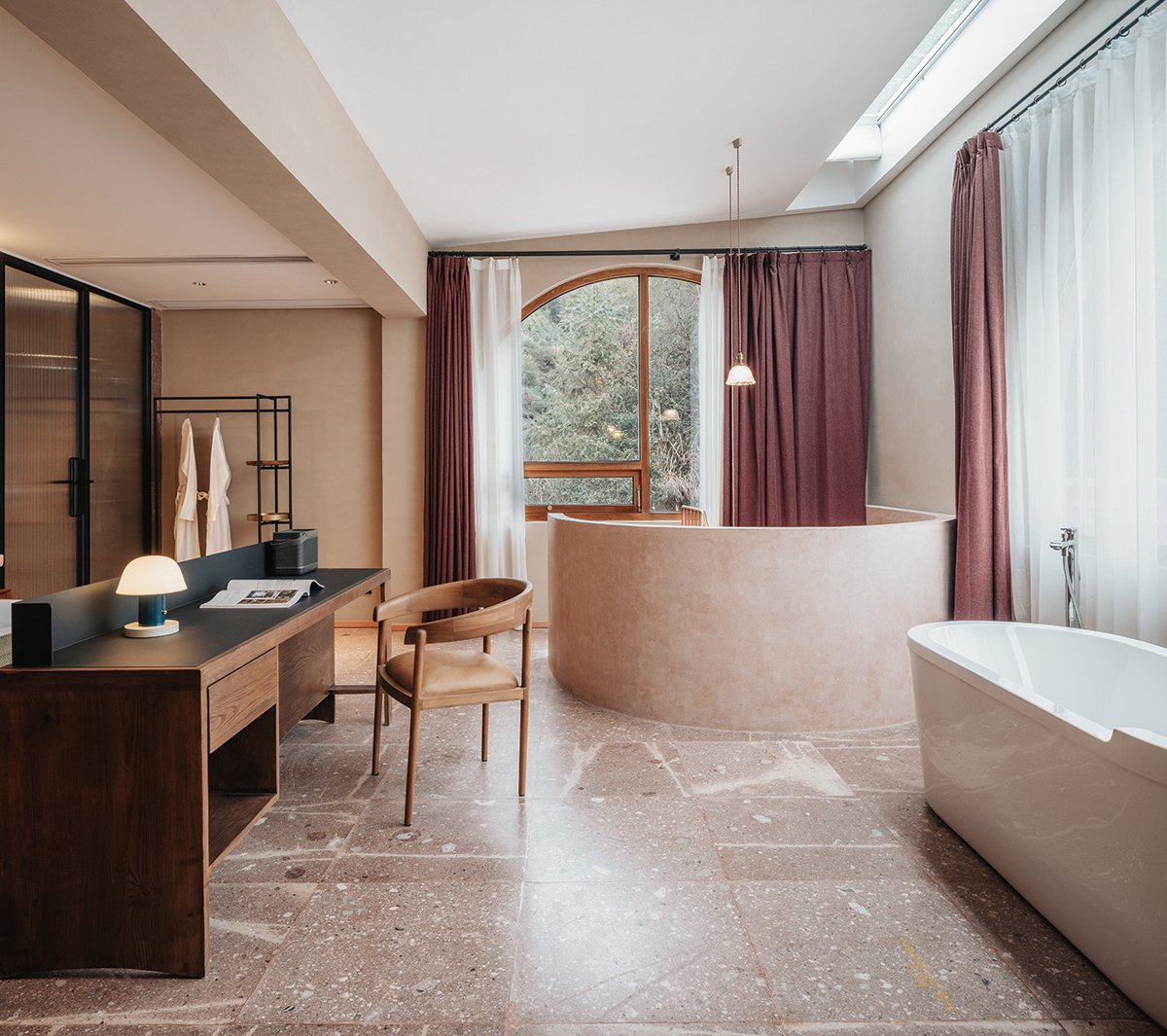
The initial understanding of and the way to get along with things will be magnified in our memories. It is common to find similar treatment in both architectural components and interior design, such as terrace grille with wrought iron railings and cast-in-place concrete handrails, vertical grille of a window facade on a long floating window, circular windows in stair patio arrays, teahouse partition with square grille and wooden doors, and horizontal grid division on the facade of the penthouse window. The arc element, originally used in the enclosure treatment, is used for the contour treatment of the multi-function hall on the top floor, for we want to enlarge the range of arc elements. Image it as a huge glass storage tank on the roof. arc elements are also adopted in the main stair patio edge treatment, the arc stair of double entry room and the post visual system. This can also be found in the use of indoor materials. Rather than singly appearing in a space, they are used in a generalized way, for example, ground made of old and new Chayuan stones, U-shaped ground glass partition and tea table, paintings with different grayscale texture, metal surface. although not too many materials are used, but they are presented in different forms many times, including use of the corresponding material on furniture, as if they are magnified in our memories. Similarities and differences co-exist at the same time, so that the changes of each part maintain a kind of relevance. To shape the interpersonal communication atmosphere of the space, our understanding of regional culture does not emphasis on neat collage of elements, instead, should promote communication and contact with local cultures, including collecting household utensils or local ingredients, and tracing the gastronomic practices, etc. The purpose of the building and the interior space is for use, or the building is a service space. It is an inexorable trend to transform rural properties for a better living at present time. The project transformation itself is a test to break and shape the relationship.
한상록
저작권자 ⓒ Deco Journal 무단전재 및 재배포 금지







0개의 댓글
댓글 정렬